Richard Mayer's experiments on multimedia learning found that people learn more deeply when slides leave out extras, point to what matters and keep words beside the pictures they describe.
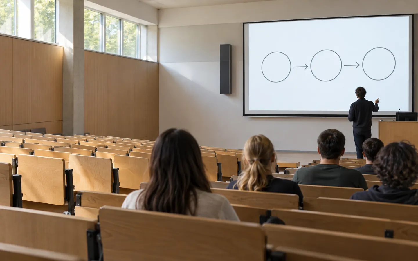
AI-generated image, not a photograph of a real person or place.
Cut what does not help
Point to what matters
Say it, do not repeat it
Clearer slides, deeper learning
THE SHORT ANSWER
Clear away the clutter.
Extra material competes for working memory. The principles all aim to free some up.
COHERENCE
Leave the extras out
People learn more deeply when interesting but irrelevant words, pictures, sounds and music are excluded. The principle held in 10 of 11 experimental tests.
Pick something you might put on a slide to see which principle applies. The bar shows how strongly the research suggests changing it.
Based on Richard E. Mayer's chapters in The Cambridge Handbook of Multimedia Learning (2005) and Multimedia Learning (2009). General guidance on presenting.
TWO NUMBERS WORTH KNOWING
Tested again and again.
How often two principles held up in Mayer's experimental tests.
10 of 11
Tests that supported cutting extras
Excluding extraneous material improved learning in 10 of 11 experimental tests, with a median effect size of 1.32.
COHERENCE · MAYER 2005
8 of 8
Tests that supported words near pictures
Presenting corresponding words and pictures near each other, rather than far apart, improved learning in every test, with a median effect size of 1.11.
SPATIAL CONTIGUITY · MAYER 2005
The redundancy principle held in 10 of 10 tests (median effect size 0.69) and signalling in 3 of 3 (0.60), in the same review.
FOUR QUICK FIXES
Before the talk, edit the deck.
These take minutes and follow directly from the principles. The Raspberry Pi Foundation's teaching guide gives the same advice for classroom slides.
Delete the decoration
Remove clip art, background music and 'fun facts' that do not serve the point. Interesting is not the same as useful.
Swap paragraphs for a picture
Replace dense text with a clear visual and say the explanation out loud instead of putting it all on screen.
Move labels onto the image
Place each label next to the part it names, so eyes do not have to travel back and forth.
Point as you go
Use arrows, colour or a highlight to show what you are talking about at that moment, and reveal it when you reach it.
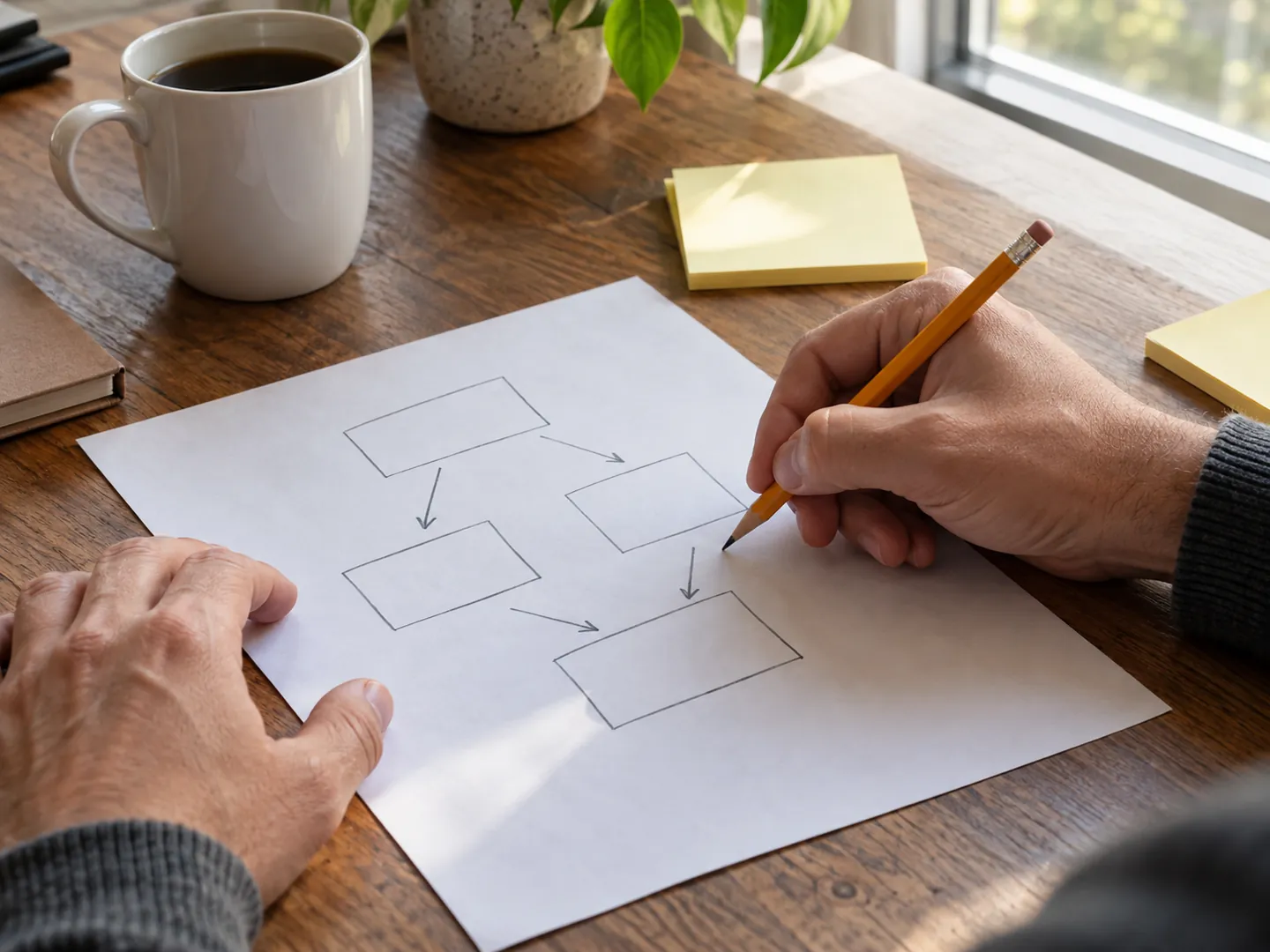
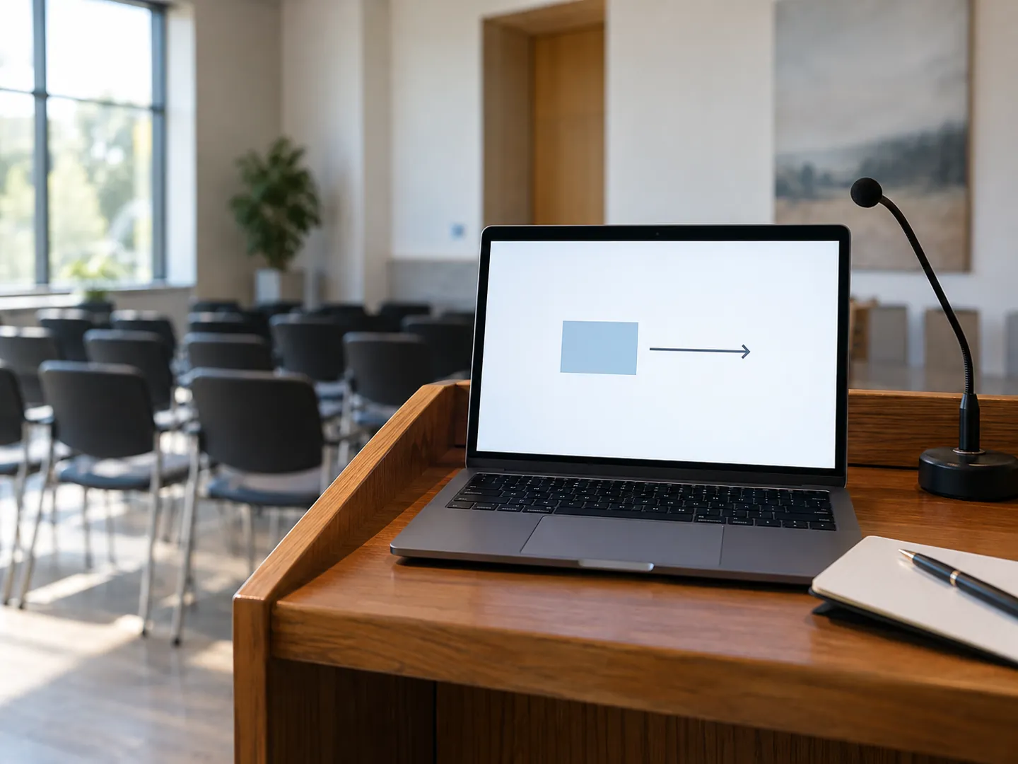
AI-generated image, not a photograph of a real person or place.AI-generated image, not a photograph of a real person or place.
WHY IT WORKS
Working memory is the bottleneck.
Mayer's theory is that extra material competes for limited working memory, distracts from the important ideas and can lead learners to fit the material to the wrong theme.
The Raspberry Pi Foundation calls these extras seductive details: information that is interesting but irrelevant. Its guide warns that the challenge can be greater for multilingual learners, who carry extra language processing.
Questions
Questions people ask
Should slides have lots of text?
Research on the redundancy principle found people learnt more from graphics and narration than from graphics, narration and on-screen text. Keep the explanation in your voice.
Are decorative pictures harmful?
The coherence principle found that interesting but irrelevant pictures, words, sounds and music tended to reduce learning, in 10 of 11 tests in Mayer's 2005 review.
What is signalling?
Adding cues such as arrows, bold or coloured text, or vocal emphasis that highlight how the essential material is organised. It was supported in three of three tests.
Where should labels go?
On the diagram, next to the part they name. The spatial contiguity principle was supported in eight of eight tests.
Who came up with these principles?
They come from Richard E. Mayer's cognitive theory of multimedia learning and his experiments, gathered in The Cambridge Handbook of Multimedia Learning and in his book Multimedia Learning.